Pearson correlation coefficient is a key measure in statistical analysis used to describe the direction and strength of a linear relationship between two quantitative variables. It is usually written as r, and it gives researchers a compact way to say whether two sets of values tend to move together, move in opposite directions, or show little clear linear pattern.
This article explains what the Pearson correlation coefficient is, how the formula works, how to calculate it, which assumptions need attention, when to use Pearson’s correlation, how it differs from Spearman’s correlation, how to interpret the result, and how to report it in academic writing.
What Is the Pearson Correlation Coefficient?
The Pearson correlation coefficient is a measure of linear association between two quantitative variables. It asks a simple question in a numerical way: when one variable changes, does the other variable tend to change in a consistent straight-line pattern?
Imagine a researcher collecting data from students on weekly study time and exam score. If students who study longer generally receive higher scores, the relationship is positive. If higher values on one variable usually go with lower values on the other, the relationship is negative. If the points in a scatterplot do not form a clear upward or downward line, the correlation will be closer to zero.
Pearson correlation coefficient definition
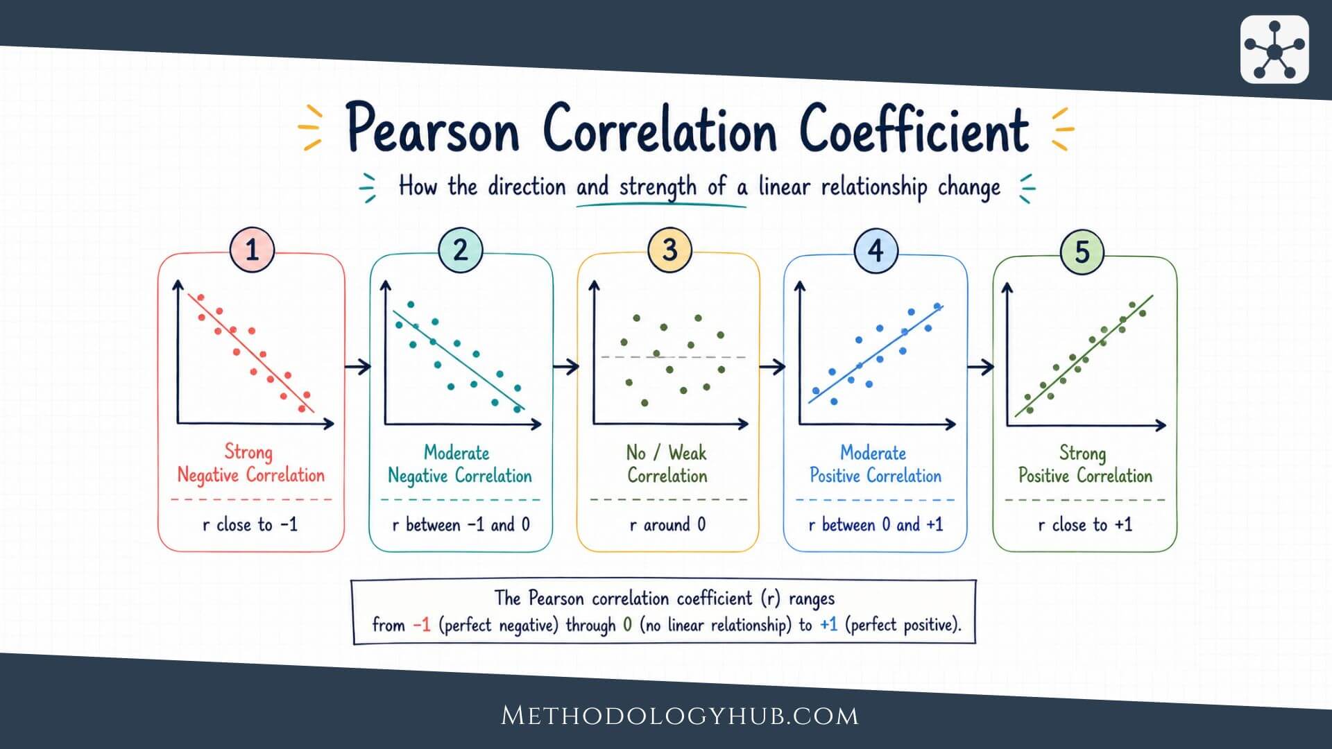
The Pearson correlation coefficient, often called Pearson’s r, measures how closely two quantitative variables follow a straight-line relationship. Its value always falls between -1 and +1. A value of +1 means a perfect positive linear relationship, -1 means a perfect negative linear relationship, and 0 means no linear relationship in the data being analysed.
The word linear is the part that should not be skipped. Pearson’s r is not a general measure of every possible kind of connection between variables. It is designed for straight-line patterns. A relationship can be strong but curved, and Pearson’s r may then give a misleadingly small value.
What Pearson’s r tells the reader
Pearson’s r gives two pieces of information at the same time. The sign tells the direction of the relationship. The size of the value tells the strength of the linear pattern. A positive value means the variables tend to increase together. A negative value means one tends to increase as the other decreases.
The absolute value shows strength. An r of -0.80 is stronger than an r of +0.30, even though the first is negative. The sign is about direction. The distance from zero is about strength.
Sample correlation and population correlation
In most research reports, the Pearson correlation coefficient is calculated from a sample. The sample value is written as r. The corresponding population correlation is usually written as ρ, pronounced rho. The sample correlation estimates the population correlation, but it is not guaranteed to be identical to it.
This distinction connects Pearson’s correlation to inferential statistics. If a researcher only describes the sample, r is a descriptive statistic. If the researcher uses that sample value to test whether a population relationship exists or to build a confidence interval, the statistical analysis becomes inferential.
Correlation, agreement, and prediction
Pearson’s r is sometimes confused with agreement. Two measures can be highly correlated and still disagree in their actual values. For example, two exam markers may rank students in almost the same order, producing a high correlation, while one marker consistently gives scores that are 8 points higher. The correlation would describe a similar pattern across students, but it would not show that the two markers give the same scores.
It is also different from prediction, although the two are connected. A correlation can show that two variables move together in a linear way. A prediction model goes further by estimating one variable from another and usually examines errors, residuals, and model fit. This is why Pearson’s r often appears beside regression analysis, but it should not be treated as the whole regression model.
Key Assumptions of the Pearson Correlation
The Pearson correlation coefficient is most useful when the data match the kind of relationship it is designed to summarise. The assumptions do not ask for perfect data. They ask whether Pearson’s r is a suitable description and, if a hypothesis test is used, whether the test result can be read with confidence.
Quantitative variables
Pearson’s correlation is intended for two quantitative variables. These are variables measured on a numerical scale where differences between values have meaning. Examples include test scores, reaction times, age in years, temperature, scale totals, and measured distances.
It is not usually suitable for nominal categories, such as school type, eye colour, or subject area. Ordinal variables require more care. If a rating scale has only a few ordered categories, Spearman’s rank correlation may fit better. If a scale score combines many items and behaves like a continuous measure, Pearson’s r may be acceptable, but that choice should be explained.
Linearity
The most central assumption is linearity. Pearson’s r measures how well the data follow a straight-line pattern. A scatterplot should therefore be examined before the coefficient is interpreted. If the plot forms a curve, Pearson’s r can underestimate or misrepresent the relationship.
For example, stress and performance may have a curved relationship in some learning situations. Very low stress may be linked with weak focus, moderate stress with stronger performance, and very high stress with lower performance. A single straight-line correlation may not describe that pattern well.
Independence of observations
Each pair of observations should be independent of the others unless the analysis is designed for repeated or clustered data. If several scores come from the same student, class, family, school, patient, or laboratory unit, ordinary Pearson correlation may treat related observations as if they were independent.
This can make the analysis appear more precise than it really is. When data are nested or repeated, researchers may need a different method, such as repeated-measures correlation, multilevel modelling, or a design-specific analysis.
Outliers and influential points
Pearson’s correlation can be sensitive to unusual observations. One extreme point can increase, decrease, or even reverse the apparent association. The issue is not simply that the point is far from the rest. The issue is whether it has strong influence on the slope and spread of the cloud of points.
Outliers should not be removed automatically. They should be checked. Sometimes they are data entry errors or measurement failures. Sometimes they are real observations that reveal a feature of the population. The researcher should document any decision to keep, correct, remove, or analyse them separately.
Similar spread across the range
Another feature to notice in a scatterplot is whether the spread of points is roughly similar across the range of the variables. Sometimes the points are tightly grouped at low values and widely scattered at high values, or the reverse. This pattern is often called unequal spread or heteroscedasticity.
Unequal spread does not automatically prevent a descriptive correlation, but it can make interpretation less tidy and can affect related inferential procedures. A plot often reveals this more clearly than a formal test. If the spread changes strongly across the range, the researcher should describe the pattern and consider whether a different analysis gives a fairer answer.
Normality for statistical inference
For describing a sample, Pearson’s r can be calculated without a formal normality test. For p-values and confidence intervals, the usual tests work best when the variables are approximately bivariately normal or when the sample is large enough for the method to be reasonably stable.
Normality should not be treated as a ritual. The more direct questions are whether the scatterplot is roughly linear, whether extreme points dominate the result, and whether the sample size and study design support the inference being made.
When to Use Pearson’s Correlation
Pearson’s correlation is appropriate when the research question asks about the linear association between two quantitative variables. It is especially useful when the aim is to describe whether higher values of one variable tend to appear with higher or lower values of another variable.
In academic research, this kind of question appears in many fields. An education researcher may examine reading time and comprehension score. A psychology researcher may examine sleep duration and attention score. A biology researcher may examine two continuous laboratory measurements. In each case, Pearson’s r can summarise the direction and strength of a linear pattern.
Use Pearson’s r for association, not cause
Pearson’s r is a measure of association. It does not show that one variable caused the other. A positive correlation between study time and exam score may fit the idea that studying helps performance, but it could also reflect prior knowledge, motivation, course difficulty, family support, or measurement differences.
Causal claims need a stronger design than correlation alone can provide. Experiments, longitudinal designs, control variables, theory, and careful measurement all affect whether a causal interpretation is reasonable. Pearson’s r can support the description of a pattern, but it cannot carry the causal claim by itself.
Use Pearson’s r when the shape is approximately straight
The coefficient works best when the scatterplot has a roughly straight-line form. The points do not need to fall exactly on a line, but the main trend should be linear enough that one line gives a fair summary.
If the relationship is curved, a different approach may be better. The researcher might transform a variable, model a curve, use regression with nonlinear terms, or choose a rank-based association measure. The choice depends on the research question and the observed data pattern.
Use Pearson’s r as a first step in broader analysis
Pearson’s correlation is often used early in analysis because it gives a compact view of pairwise relationships. It can help researchers understand a dataset before moving to more complex models. For example, a correlation matrix can show how several scale scores are associated before a regression analysis is planned.
Still, correlation should not be treated as a substitute for a research design. It does not adjust for other variables unless a different method is used. If the research question involves prediction, control variables, or several predictors at once, regression or another modelling approach may be more suitable.
Formula for the Pearson Correlation Coefficient
The formula for the Pearson correlation coefficient looks more complicated than the idea behind it. The calculation compares how far each value of x is from the mean of x with how far the matching value of y is from the mean of y. When those deviations usually have the same sign, the correlation becomes positive. When they usually have opposite signs, it becomes negative.
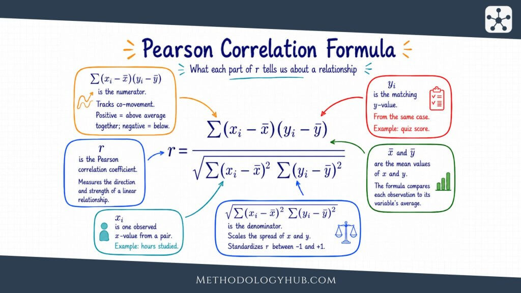
In this formula, xi and yi are paired observations, x̄ and ȳ are the sample means, and the summation sign means that the paired quantities are added across all observations. The numerator captures whether the two variables vary together. The denominator standardises that value so the result stays between -1 and +1.
Formula in words
A less symbolic way to read the formula is this: Pearson’s r is the covariance of the two variables divided by the product of their standard deviations. That standardisation is useful because it removes the original units. A correlation between height and arm span is not measured in centimetres, and a correlation between study time and test score is not measured in hours or points.
This is why correlations can be compared across different pairs of variables more easily than raw covariances. Covariance depends on the units of measurement. Pearson’s r does not.
What the formula is doing
The formula begins by centring both variables around their means. It then examines whether each pair of scores tends to sit on the same side of both means or on opposite sides. If high x values often appear with high y values, and low x values often appear with low y values, the products in the numerator are mostly positive. The result moves toward +1.
If high x values often appear with low y values, the products are mostly negative. The result moves toward -1. If positive and negative products roughly cancel out, the result moves toward zero.
Why the coefficient is standardised
The standardisation in the denominator is what makes Pearson’s r easy to compare across studies and variables. Without it, the result would depend on the original scale. A dataset measured in centimetres would produce a different covariance from the same dataset measured in metres. Pearson’s r avoids that problem by dividing by the spread of both variables.
This does not mean that scale is irrelevant to the study. Good measurement still shapes the quality of the result. A poorly designed scale, inconsistent test, or imprecise instrument can weaken a correlation because the observed values contain more noise. The formula standardises units, but it cannot repair weak measurement.
Calculating the Pearson Correlation Coefficient
The Pearson correlation coefficient can be calculated by hand, although statistical software is usually used in research. A hand calculation is still useful because it shows what the statistic is doing. The process begins with paired data. Each observation must have a value for both variables.
Suppose a teacher records study hours and exam scores for five students. This small dataset is only for illustration. A real study would usually need more observations, a clear sampling plan, and a reasoned analysis of assumptions.
| Student | Study hours | Exam score |
|---|---|---|
| A | 2 | 62 |
| B | 3 | 66 |
| C | 5 | 74 |
| D | 6 | 78 |
| E | 8 | 85 |
Step-by-step calculation
For this example, study hours are treated as x and exam scores are treated as y. The goal is to calculate Pearson’s r from the five paired observations shown above.
Step 1: Calculate the mean of each variable
The first step is to calculate the mean of study hours and the mean of exam scores. The mean is found by adding all values in a variable and dividing by the number of observations.
Mean of study hours:
x̄ = (2 + 3 + 5 + 6 + 8) / 5
x̄ = 24 / 5
x̄ = 4.8
Mean of exam scores:
ȳ = (62 + 66 + 74 + 78 + 85) / 5
ȳ = 365 / 5
ȳ = 73
So the average study time is 4.8 hours, and the average exam score is 73. These two means are the reference points for the rest of the calculation.
Step 2: Subtract each mean from each observed value
The second step is to calculate a deviation score for each value. A deviation score shows how far one observation is above or below the mean. For study hours, each value is compared with 4.8. For exam scores, each value is compared with 73.
| Student | x | y | x – x̄ | y – ȳ |
|---|---|---|---|---|
| A | 2 | 62 | 2 – 4.8 = -2.8 | 62 – 73 = -11 |
| B | 3 | 66 | 3 – 4.8 = -1.8 | 66 – 73 = -7 |
| C | 5 | 74 | 5 – 4.8 = 0.2 | 74 – 73 = 1 |
| D | 6 | 78 | 6 – 4.8 = 1.2 | 78 – 73 = 5 |
| E | 8 | 85 | 8 – 4.8 = 3.2 | 85 – 73 = 12 |
The signs already show the direction of the relationship. Students below the mean in study hours are also below the mean in exam score. Students above the mean in study hours are also above the mean in exam score.
Step 3: Multiply the paired deviations
The third step is to multiply each study-hours deviation by the matching exam-score deviation. This is done row by row, because Pearson’s correlation is based on paired observations.
| Student | x – x̄ | y – ȳ | (x – x̄)(y – ȳ) |
|---|---|---|---|
| A | -2.8 | -11 | -2.8 x -11 = 30.8 |
| B | -1.8 | -7 | -1.8 x -7 = 12.6 |
| C | 0.2 | 1 | 0.2 x 1 = 0.2 |
| D | 1.2 | 5 | 1.2 x 5 = 6.0 |
| E | 3.2 | 12 | 3.2 x 12 = 38.4 |
Sum of paired deviation products:
Σxy = 30.8 + 12.6 + 0.2 + 6.0 + 38.4
Σxy = 88.0
Because all products are positive in this small example, the numerator of the correlation formula is positive. That is why the final Pearson correlation coefficient will also be positive.
Step 4: Square and add the deviations for each variable
The fourth step is to square each deviation. Squaring removes negative signs and shows how much total variation there is in each variable around its own mean.
| Student | x – x̄ | (x – x̄)2 | y – ȳ | (y – ȳ)2 |
|---|---|---|---|---|
| A | -2.8 | 7.84 | -11 | 121 |
| B | -1.8 | 3.24 | -7 | 49 |
| C | 0.2 | 0.04 | 1 | 1 |
| D | 1.2 | 1.44 | 5 | 25 |
| E | 3.2 | 10.24 | 12 | 144 |
Sum of squared study-hour deviations:
Σx2 = 7.84 + 3.24 + 0.04 + 1.44 + 10.24
Σx2 = 22.8
Sum of squared exam-score deviations:
Σy2 = 121 + 49 + 1 + 25 + 144
Σy2 = 340
At this point, the calculation has the three quantities needed for the formula: the sum of paired products, the sum of squared deviations for x, and the sum of squared deviations for y.
Step 5: Insert the values into the Pearson correlation formula
The final step is to place the three sums into the Pearson correlation formula. The numerator is the sum of the paired products. The denominator is the square root of the two sums of squared deviations multiplied together.
Formula:
r = Σxy / sqrt(Σx2 x Σy2)
Insert the values:
r = 88.0 / sqrt(22.8 x 340)
r = 88.0 / sqrt(7752)
r = 88.0 / 88.045
r = 0.999
For the five observations above, Pearson’s r is approximately 0.999. Rounded to two decimal places, this would be 1.00. That does not mean real research data usually behave this neatly. The example is small and orderly because it is meant to show the calculation clearly.
The result is positive because higher study-hour values appear with higher exam scores, and lower study-hour values appear with lower exam scores. It is also very close to +1 because the points follow an almost perfectly straight upward pattern.
In larger datasets, the pattern is rarely this clean. Some observations support the main trend, some work against it, and some sit close to the centre. Pearson’s r combines all of those paired deviations into one summary.
Calculating Pearson’s r with software
Most researchers calculate Pearson’s r with software such as R, SPSS, Stata, Jamovi, Excel, Python, or a statistical calculator. The software usually returns the correlation coefficient and may also return a p-value, confidence interval, and sample size.
Software does not remove the need for judgement. Before accepting the output, the researcher should check whether the data are paired correctly, whether missing values were handled as intended, whether a scatterplot supports a linear reading, and whether outliers are distorting the result.
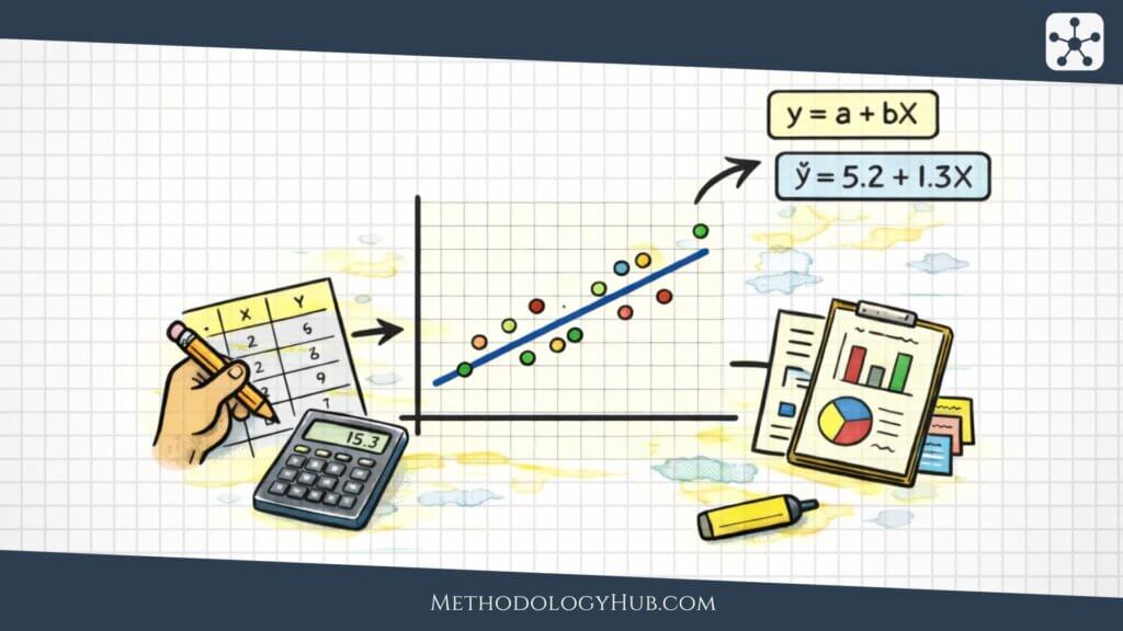
For a quick online calculation, you can also use the Linear Regression Calculator on MethodologyHub. It is a free tool for calculating and interpreting a simple linear regression with Y as the dependent variable and X as the independent variable. It returns a compact summary, a short interpretation, a scatter plot with a regression line, an ANOVA table, and a coefficient table. Incomplete rows are ignored automatically.
This can also help when working with Pearson’s correlation, because simple linear regression and Pearson’s r are closely connected when there is one quantitative predictor and one quantitative outcome. The scatter plot is especially useful, because it lets the researcher see whether the relationship looks roughly linear before placing too much weight on the numerical result.
From calculation to interpretation
The calculation gives a number, but the number is only the beginning. A correlation of 0.45 may be large in one research setting and modest in another. The interpretation depends on the research question, measurement quality, sample size, field norms, and the visual pattern in the data.
That is why a good correlation analysis usually includes both a numerical result and a plot. The number summarises the association. The plot shows whether the summary is faithful to the data.
Interpreting Pearson’s Correlation Coefficient
Interpreting the Pearson correlation coefficient begins with the sign, the size, and the context. The sign tells direction. The size tells the strength of the linear relationship. The context tells whether that strength is large enough to be meaningful for the research question.

Direction of the relationship
A positive Pearson correlation means that higher values of one variable tend to appear with higher values of the other. A negative Pearson correlation means that higher values of one variable tend to appear with lower values of the other. A value near zero means that the sample does not show a clear linear pattern.
Direction should be described in plain language. Instead of writing only “r was positive,” explain which variables tend to rise or fall together. For example: students with more weekly study hours tended to have higher exam scores.
Negative correlations deserve the same care. A negative value does not mean that the relationship is weak or undesirable. It simply means that the variables move in opposite directions. In a study of reaction time and task accuracy, for instance, a negative correlation could mean that faster responses tend to appear with higher accuracy, depending on how the variables are coded.
Strength of the relationship
Many textbooks give rough labels for correlation strength, such as weak, moderate, and strong. These labels are useful for beginners, but they should not be applied mechanically. A correlation of 0.30 may be meaningful in one field and less informative in another.
| Value of r | General reading | Plain interpretation |
|---|---|---|
| Close to +1 | Strong positive linear relationship | Higher values of one variable usually go with higher values of the other. |
| Close to -1 | Strong negative linear relationship | Higher values of one variable usually go with lower values of the other. |
| Close to 0 | Little linear relationship | The data do not show a clear straight-line pattern. |
Statistical significance
A significance test for Pearson’s correlation usually evaluates the null hypothesis that the population correlation is zero. In symbols, that is often written as H0: ρ = 0. A small p-value suggests that the sample correlation would be unusual if the population correlation were truly zero, assuming the test conditions are reasonable.
The p-value should not replace interpretation of the coefficient itself. A small correlation can become statistically significant in a large sample. A larger correlation can be non-significant in a small sample. The coefficient, confidence interval, sample size, p-value, and design should be read together.
Confidence intervals
A confidence interval around Pearson’s r gives a range of plausible values for the population correlation. This range is often more informative than the coefficient alone. A sample result of r = .35 may look similar across two studies, but one study may have a narrow interval and the other a wide one because the sample sizes differ.
When the interval is wide, the estimate is less precise. When it is narrow, the study gives a more focused estimate of the population association. A confidence interval also helps readers see whether the data are compatible with very small, moderate, or stronger associations.
Coefficient of determination
The square of Pearson’s r, written as r2, is called the coefficient of determination in simple linear settings. It gives the proportion of variance in one variable that is linearly associated with variance in the other variable.
For example, if r = 0.50, then r2 = 0.25. This means that 25% of the variance is shared in a linear sense. It does not mean that one variable causes 25% of the other variable, and it does not describe individual cases. It is a sample-level summary of linear association.
Pearson vs Spearman
Pearson and Spearman correlations are often taught together because both describe association between two variables. They answer related questions, but they are not the same tool. Pearson’s correlation works with the original numerical values and focuses on linear association. Spearman’s correlation works with ranks and focuses on monotonic association.
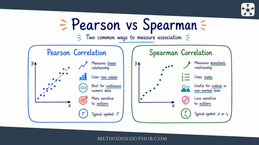
A monotonic relationship means that as one variable increases, the other generally moves in one direction, though not necessarily in a straight line. This makes Spearman’s correlation useful when the data are ordinal, strongly skewed, affected by outliers, or related in a curved but consistently increasing or decreasing way.
| Feature | Pearson correlation | Spearman correlation |
|---|---|---|
| Main focus | Linear association | Monotonic association |
| Data used | Original values | Ranks of values |
| Suitable variables | Quantitative variables | Ordinal or quantitative variables |
| Sensitivity | More sensitive to outliers | Often less sensitive to extreme values |
Choosing between Pearson and Spearman
The choice should follow the research question and the data. If the variables are quantitative and the scatterplot suggests a straight-line relationship, Pearson’s r is usually the natural starting point. If the variables are ranks or ordered categories, Spearman’s correlation is often more suitable.
If the relationship is clearly monotonic but not linear, Spearman may describe it better. If unusual points are strongly pulling Pearson’s r, Spearman can be used as a sensitivity check. The goal is not to choose the method that gives the larger number. The goal is to choose the method that describes the relationship the study is actually asking about.
Using both coefficients carefully
Some researchers report both Pearson and Spearman correlations as a check on the analysis. This can be useful, but only if the two coefficients are interpreted clearly. If Pearson and Spearman are similar, the linear and ranked patterns may be telling a similar story. If they differ sharply, the scatterplot should be examined again.
A large difference between the two can point to outliers, nonlinearity, tied ranks, or a small number of influential cases. In that situation, reporting both numbers without explanation can confuse the reader. The comparison is most useful when it leads back to the shape of the data.
Limitations of the Pearson Correlation
The Pearson correlation coefficient is useful because it compresses a relationship into one readable number. That same strength is also its weakness. A single number can hide shape, clusters, unusual observations, measurement problems, and the design limits of the study.
Correlation does not show causation
The best-known limitation is causal interpretation. Pearson’s r can show that two variables are associated, but it does not show which variable influenced the other or whether a third variable is involved. A correlation between attendance and grades, for example, may reflect study habits, prior achievement, motivation, course format, or several influences at once.
This does not make correlation unhelpful. It means that the conclusion should match the design. A correlational study can describe a relationship and support further analysis. It should not be written as if it proves a cause.
Nonlinear relationships can be missed
Pearson’s r can be close to zero even when the variables are strongly related in a curved way. This is why a scatterplot is more than a decorative figure. It shows whether the coefficient is summarising the pattern that actually appears in the data.
If the relationship is curved, the researcher may need a different model or a different coefficient. Forcing a Pearson correlation onto a clearly nonlinear pattern can make a real relationship look weak or absent.
Outliers can change the result
Outliers can have a strong effect on Pearson’s r. A single unusual observation may create an apparent association where the rest of the data show little pattern. It may also hide an association that appears among most observations.
A responsible analysis should therefore compare the numerical coefficient with the scatterplot. If the conclusion changes when one point is checked, the report should say so. That does not automatically invalidate the result, but it changes how confidently the coefficient can be read.
Restricted range can weaken r
Restricted range occurs when the sample contains only a narrow part of the full variation in one or both variables. For example, if a study includes only students with very high prior achievement, the correlation between study time and exam score may look smaller than it would in a broader sample.
The coefficient can only describe variation that is present in the data. If the sample method removes much of that variation, Pearson’s r may understate the association that would appear in a wider population.
Measurement error can weaken the coefficient
Pearson’s r is calculated from observed values, not from perfectly known quantities. If the variables are measured with error, the observed association may be weaker than the association between the underlying constructs. This can happen with short tests, unreliable instruments, inconsistent coding, or self-report measures affected by recall.
Measurement quality should therefore be part of interpretation. A small correlation may reflect a genuinely weak relationship, but it may also reflect noisy measurement. A strong correlation may still be difficult to interpret if one or both variables are poorly defined.
Grouped data can create misleading patterns
Sometimes the overall correlation differs from the correlation within groups. A dataset that combines several classes, schools, treatment groups, or age groups may show an association that is partly created by group differences. Within each group, the relationship may be weaker, stronger, or even reversed.
This is one reason correlation should be interpreted with the study design in view. If groups exist in the data, the researcher should examine whether one overall coefficient is enough or whether group-specific patterns need to be shown.
How to Report the Pearson Correlation Coefficient
Reporting the Pearson correlation coefficient should give the reader enough information to understand the result without rerunning the analysis. At minimum, the report should name the variables, give the coefficient, state the sample size, and interpret the direction and strength in relation to the research question.
Basic reporting format
A concise report may look like this:
Example: Study hours and exam score were positively correlated, r(48) = .42, p = .003. Students who reported more study hours tended to have higher exam scores.
The number in parentheses is usually the degrees of freedom for the correlation test, which is n – 2. In the example above, r(48) implies a sample size of 50. Some styles prefer reporting n directly, especially for readers who may not infer it from degrees of freedom.
What to include in a fuller report
A fuller report may include the sample size, confidence interval, exact p-value, descriptive statistics, and a note about the scatterplot or assumption checks. This is especially useful when the correlation is central to the analysis rather than a small supporting result.
For example: “There was a positive linear association between weekly study hours and exam score, r = .42, 95% CI [.16, .63], p = .003, n = 50. The scatterplot showed an approximately linear pattern with no single point dominating the association.” This version gives the reader both the result and some evidence that the summary was checked.
Reporting correlation matrices
When a study includes several variables, researchers often report a correlation matrix. This is a table showing the Pearson correlations among all pairs of variables. A matrix can be useful, but it should be readable. The table should name variables clearly, show sample sizes if they differ, and explain any symbols used for statistical significance.
A matrix should not replace interpretation. If one or two correlations are central to the research question, those results should also be discussed in the text. The reader should not have to search a table to find the result that supports the main analysis.
Reporting non-significant correlations
Non-significant correlations should be reported with the same care as significant ones. A result such as r = .18, p = .21 does not prove that no relationship exists. It means the sample did not provide enough evidence to reject a zero population correlation under the test used.
When the sample is small or the confidence interval is wide, this distinction becomes especially important. The result may be uncertain rather than clearly absent. Reporting the confidence interval helps readers see that uncertainty.
Writing the interpretation
The interpretation should stay close to the design. If the study is correlational, use association language: “was associated with,” “was correlated with,” or “tended to occur with.” Avoid causal wording such as “increased,” “reduced,” or “led to” unless the design supports that claim.
It is also helpful to avoid overloading the report with too many labels. A sentence that says the variables were “moderately positively correlated” can be useful, but it should be followed by a plain explanation of what that means in the study.
Conclusion
The Pearson correlation coefficient gives researchers a clear way to summarise the direction and strength of a linear relationship between two quantitative variables. It is easy to report, widely recognised, and closely connected to other statistical tools such as regression, confidence intervals, and hypothesis testing.
Its simplicity, however, should not lead to automatic interpretation. Pearson’s r works best when the variables are quantitative, observations are paired and independent, the relationship is roughly linear, and unusual observations do not dominate the pattern. A scatterplot, a confidence interval, and a careful reading of the study design often tell the reader as much as the coefficient itself.
Used well, the Pearson correlation coefficient is not just a number between -1 and +1. It is a compact summary of how two measured variables move together in a sample, and sometimes a starting point for estimating or testing a population relationship.
FAQs on Pearson Correlation Coefficient
What is the Pearson correlation coefficient?
The Pearson correlation coefficient is a statistic that measures the direction and strength of a linear relationship between two quantitative variables. It is usually written as r and ranges from -1 to +1.
What does a Pearson correlation of 0 mean?
A Pearson correlation of 0 means that the data do not show a linear relationship between the two variables. It does not prove that the variables are completely unrelated, because a curved or more complex relationship may still exist.
What is a strong Pearson correlation coefficient?
A strong Pearson correlation coefficient is usually one that is far from zero, such as values near +1 or -1. The exact interpretation depends on the field, measurement quality, sample size, and research question.
When should I use Pearson’s correlation?
Use Pearson’s correlation when you have two quantitative variables and want to describe their linear association. A scatterplot should show that a straight-line summary is reasonable, and observations should be paired and independent.
What is the difference between Pearson and Spearman correlation?
Pearson correlation measures linear association using the original numerical values. Spearman correlation measures monotonic association using ranks. Spearman is often preferred for ordinal data, strongly skewed data, or relationships that move consistently in one direction but are not straight-line.