Correlation analysis is a statistical method for looking at the way two variables move in relation to each other. It asks whether higher values in one variable usually appear alongside higher values in another, whether they tend to appear alongside lower values, or whether the data shows no steady pattern.
This article covers the main ideas behind correlation analysis, including what it measures, where it is used, how correlation coefficients are read, and how positive and negative relationships should be interpreted.
What is correlation analysis?
Correlation analysis is a statistical method used to measure the direction and strength of association between two variables. The result is usually shown as a correlation coefficient, with many coefficients running from -1 to +1. Values near +1 point to a strong positive association, values near -1 point to a strong negative association, and values near 0 suggest little or no linear or monotonic association, depending on the method used.
That definition is a good starting point, as long as one caution stays attached to it: correlation describes association, not proof of cause. Two variables can move together because one affects the other, because both are affected by a third variable, because the direction runs the other way, because the sample is unusual, or because the pattern appears only inside one part of the data.
A good correlation analysis does more than produce a number. It starts by looking at the variables, checking the scatter plot, thinking about the measurement scale, and choosing a coefficient that fits the data. The result then needs to be interpreted in plain terms, without making claims that the analysis itself cannot support.
What correlation analysis is actually asking
One practical way to understand correlation analysis is to separate the measurement question from the explanation question. The measurement question is simple: do these two variables change together? The explanation takes more work. Even when the answer is yes, the next task is to ask why the pattern exists. Correlation gives the first piece of that discussion, not the whole answer.
For example, a researcher might find that reading time is positively correlated with vocabulary test scores. That means students who report more reading time also tend to have higher scores. It does not show whether reading raised those scores, whether stronger readers choose to read more, whether family background affects both variables, or whether reading time was measured well. The correlation is a useful signal, but it is not a complete explanation.
That position makes correlation analysis both helpful and limited. It is more systematic than casual observation because it gives a numerical summary of the pattern. It is weaker than a carefully designed causal study because it does not remove competing explanations on its own. Used well, it points to relationships worth examining. Used carelessly, it can make early evidence sound more certain than it is.
When correlation analysis is used
Correlation analysis is used when the question is about association rather than direct prediction or cause and effect. Analysts often use it near the start of a project to see whether variables appear related, while researchers use it to report how strongly two measurements move together.
In education, it can help examine whether study time is associated with exam performance. In psychology, it may show whether two questionnaire scales tend to rise and fall together. In medicine, it can compare two physiological measurements. In environmental research, it can test whether temperature and pollutant concentration move together across observation days.
Typical uses of correlation analysis
- Exploring relationships: checking whether two variables appear connected before deeper modeling.
- Summarizing association: reporting how strongly two measurements move together.
- Checking measurement tools: seeing whether two scales, tests, or instruments produce related scores.
- Screening variables: identifying variables that may be useful in a later regression model.
- Detecting redundancy: finding variables that are so closely related that they may be measuring nearly the same thing.
Correlation is especially useful when the relationship can be described with a simple pairwise question. When the aim is to know whether two continuous measurements tend to rise together, a correlation coefficient may be enough. When the aim is to predict an outcome while accounting for several other variables, regression analysis is usually the better choice.
Where correlation fits in a research workflow
In a typical research workflow, correlation analysis comes after descriptive statistics and before more involved modeling. First, each variable is checked on its own, including its distribution, missing values, measurement scale, and possible data errors. Then pairs of variables can be compared to see whether a relationship appears. Correlation is one of the simplest ways to summarize those pairwise patterns.
That does not mean every possible pair of variables should be correlated without a reason. Large datasets make it easy to generate a wide correlation matrix and then search through dozens or hundreds of coefficients. Some will look interesting simply by chance. A stronger approach is to connect each correlation to a clear question: why are these variables being compared, what pattern would be expected, and what would a strong or weak result mean in that setting?
In a research report, correlation analysis can do several jobs. It can describe the relationship between the main variables, show how much two measurement scales overlap, reveal when two predictors are so similar that they may cause problems in the same model, or help decide whether a more detailed analysis is worth running. In every case, the coefficient matters because of the question behind it.
How correlation coefficients work
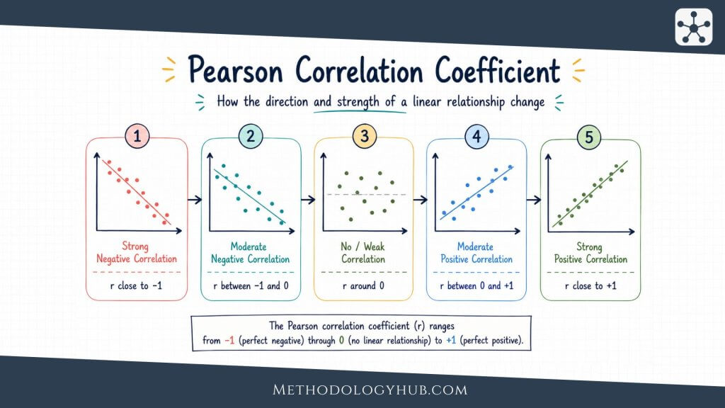
A correlation coefficient is one number that summarizes the association between two variables. Most commonly used coefficients are scaled from -1 to +1. The sign shows the direction of the relationship, while the size of the number shows how strong the relationship is under that coefficient’s definition.
A coefficient of +1 represents a perfect positive association under the method being used, while a coefficient of -1 represents a perfect negative association. A value close to 0 means the coefficient did not detect a clear relationship of the type it measures. That wording matters. A Pearson correlation near 0 means there is little linear association, although a curved relationship may still exist.
Positive correlation
A positive correlation means that higher values of one variable tend to appear with higher values of the other. In a student sample, hours spent practicing a skill may be positively correlated with performance on a practical assessment. The relationship does not have to be perfect. It only needs to show a general upward tendency.
On a scatter plot, a positive correlation usually looks like points rising from left to right. Some cases can still sit against the pattern. A student may practice a lot and score poorly because of anxiety, illness, weak practice quality, or ordinary variation. Another may practice less and score well because of strong prior knowledge. Correlation allows for those exceptions because it describes the overall tendency, not every individual case.
Negative correlation
A negative correlation means that higher values of one variable tend to appear with lower values of the other. For example, the number of missed classes may be negatively correlated with final course score. Students who miss more classes may tend to score lower, even though individual exceptions will still exist.
Negative correlation should not be read as a bad result. The word negative only describes direction. In many settings, a negative relationship is exactly what an analyst expects to see. A higher dose of an effective treatment may be associated with lower symptom severity. Greater distance from a pollution source may be associated with lower exposure readings. More error correction practice may be associated with fewer repeated mistakes. The meaning comes from the variables, not from the sign alone.
Weak or no correlation
A weak correlation means the pattern is loose. The variables may have little relationship, or the relationship may be real but poorly matched to the coefficient being used. A near-zero Pearson correlation does not prove that two variables are unrelated in every sense. A clearly curved pattern can still produce a Pearson correlation close to zero.
This is one reason scatter plots matter so much. Imagine data where moderate stress is linked with better performance, while very low and very high stress are both linked with lower performance. That relationship is curved. A straight-line coefficient may miss it or describe it badly. A weak coefficient can mean there is no relationship, but it can also mean the wrong summary has been chosen.
Why the scale runs from -1 to +1
The -1 to +1 scale makes correlations comparable across variables measured in different units. Height may be recorded in centimeters, blood pressure in millimeters of mercury, exam scores in points, and reaction time in milliseconds. The coefficient strips away the original units and reports a standardized association, which is why the same scale can be used across many kinds of data.
That shared scale can also make correlation seem more exact than it really is. A value such as 0.62 looks precise, but it is still an estimate from a particular sample. A different sample from the same population might produce 0.55 or 0.70. The coefficient should be read as a summary of the data in hand, not as the final truth about the wider population.
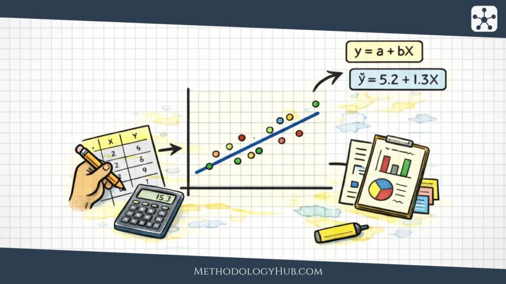
Correlation coefficient formulas
The formulas behind correlation are worth understanding because they show what the coefficient is actually doing. Most users do not need to calculate every value by hand, but the formulas help explain why the method responds to scale, spread, ranking, ties, and unusual observations.
Pearson correlation coefficient formula
Pearson correlation measures linear association between two numerical variables. It looks at how each x value and each y value differs from its own mean. When high x values tend to be paired with high y values, the coefficient moves in a positive direction. When high x values tend to be paired with low y values, it moves in a negative direction.
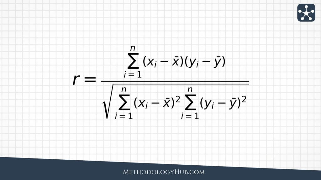
The numerator checks whether the two variables tend to move away from their means in the same direction. If values above the x mean usually sit with values above the y mean, the products are mostly positive. If values above the x mean usually sit with values below the y mean, the products are mostly negative. The denominator standardizes the result so the final coefficient fits the -1 to +1 scale.
Because of that standardization, Pearson correlation does not change simply because the same values are converted into another unit. Measuring height in centimeters rather than meters will not change its correlation with weight. The raw numbers shift, but the standardized relationship remains the same. What can change the coefficient is the shape of the pattern, the spread of the values, and the influence of unusual points.
Spearman correlation coefficient formula
Spearman correlation is based on ranks rather than the original values. It is useful when the relationship is monotonic, meaning the variables tend to move consistently in one direction, even if the pattern does not form a straight line. It also works well with ordinal data, such as rankings, ordered survey responses, or scores where the order is clearer than the distance between values.
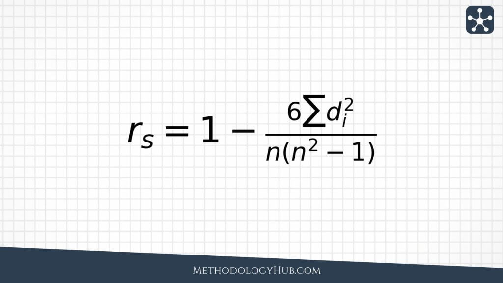
In practice, Spearman correlation is often found by ranking both variables and then calculating Pearson correlation on those ranks. This makes it less dependent on the exact spacing between values. If one student scores 70 and another scores 90, Spearman focuses on who ranks higher rather than on the 20-point gap. That can be helpful when the order is more trustworthy than the precise difference.
Tied ranks need some care. When several observations share the same value, they receive tied or averaged ranks. Statistical software normally handles this step, but the interpretation still needs to respect the data. If many responses are tied, such as when a large share of people choose the same option on a short survey scale, the coefficient has less room to show a detailed pattern.
Kendall’s tau
Kendall’s tau is rank-based as well, although it approaches the problem differently from Spearman correlation. It compares pairs of observations. When two observations are ordered the same way on both variables, the pair is concordant. When the order differs, the pair is discordant. Kendall’s tau summarizes which type of pair is more common.
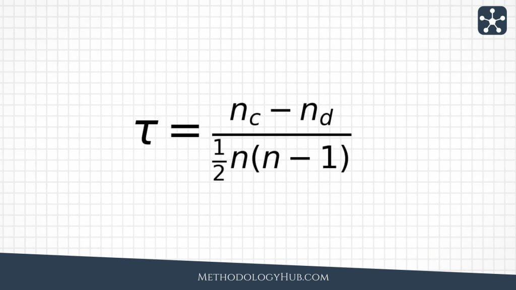
Kendall’s tau is often used with ordinal data, small samples, or situations where a pairwise interpretation is helpful. A positive tau means concordant pairs are more common than discordant pairs. A negative tau means discordant pairs are more common. When tau is close to zero, neither ordering clearly dominates.
Types of correlation analysis
Different correlation coefficients answer related but slightly different questions. The right choice depends on the data type, the shape of the relationship, the presence of outliers, and whether the analyst wants to work with raw values or with ranks.
Pearson correlation
Pearson correlation is the most familiar correlation coefficient. It measures the strength and direction of a linear relationship between two numerical variables. Linear means the pattern can be summarized reasonably well by a straight line. When a scatter plot forms an upward or downward cloud around a line, Pearson correlation is often a sensible choice.
For example, in a biology class dataset, height and arm span may show a strong positive Pearson correlation because taller students usually have longer arm spans. The relationship will not be exact for every student, but the general straight-line pattern is likely to be clear.
When Pearson correlation is useful
- both variables are numerical
- the relationship is roughly linear
- extreme outliers are not driving the result
- the aim is to measure linear association
Pearson correlation is often used with measured variables such as height, weight, temperature, pressure, reaction time, exam score, concentration, and physiological readings. It suits situations where the measurement scale is meaningful and the analyst wants to know whether the variables move together in a roughly straight-line way.
Its main weakness is sensitivity to unusual observations. One point far away from the rest of the data can make the correlation look stronger or weaker than the main cluster suggests. Pearson correlation can also miss relationships that are real but curved. For that reason, it should usually be read alongside a scatter plot rather than treated as a standalone answer.
Spearman correlation
![]()
Spearman correlation measures association after the values are converted into ranks. It is useful when the relationship is monotonic rather than strictly linear. In a monotonic relationship, the variables tend to move in a consistent direction, even when the rate of change is uneven.
Suppose a researcher compares students’ ranked stress levels with their ranked sleep quality. The original measurements may be ordinal, or the spacing between response options may not be equal. Spearman correlation can still ask whether higher stress ranks tend to go with poorer sleep ranks.
When Spearman correlation is useful
- one or both variables are ordinal
- the relationship is monotonic but not linear
- outliers make Pearson correlation unstable
- rank order is more meaningful than exact distance between values
Spearman correlation is often the safer option when values have a clear order but the gaps between them are hard to defend. Many questionnaire responses work this way. A response of 4 is higher than a response of 3, but the psychological distance between 3 and 4 may not match the distance between 1 and 2. Ranking the values is a more cautious way to work with that type of data.
Spearman correlation can also help when the relationship bends but does not reverse. Exam scores, for instance, may rise quickly as study hours increase and then level off after a point. Pearson correlation may still be positive, but Spearman can better match the question if the analyst mainly wants to know whether more study generally goes with a higher score.
Kendall’s tau
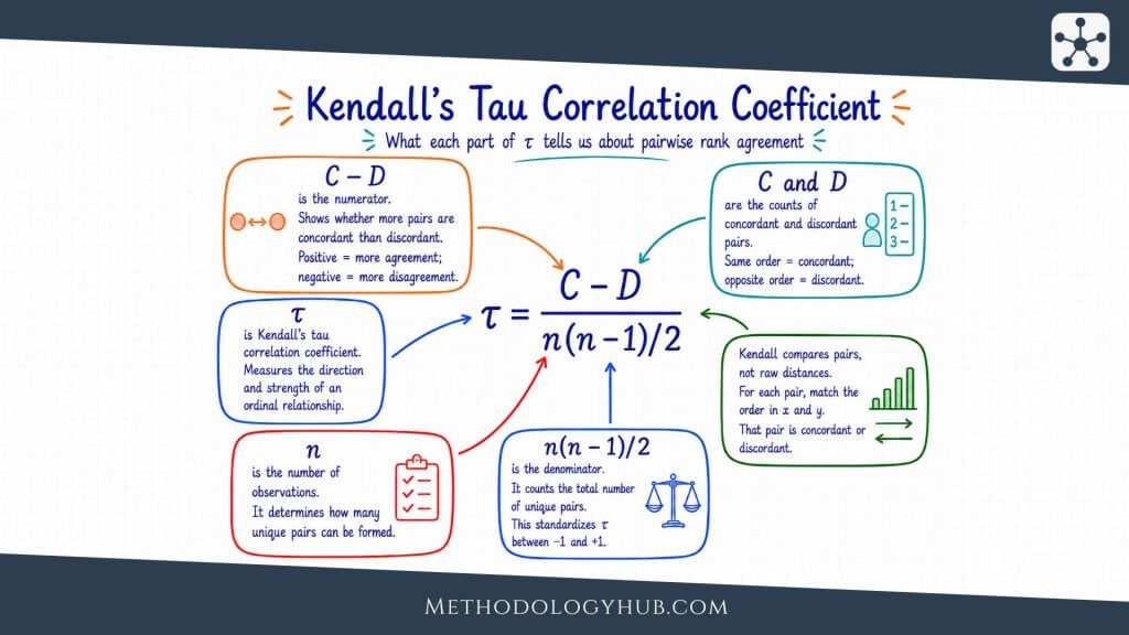
Kendall’s tau is another coefficient built on ranks. It asks whether pairs of observations are ordered consistently across the two variables. This gives it a different interpretation from Spearman correlation, and it can be easier to explain when the question is about agreement between rankings.
For example, if two examiners rank the same essays from strongest to weakest, Kendall’s tau can summarize how often they place essay pairs in the same order. When both examiners usually agree about which essay is stronger within a pair, tau will be positive and high.
When Kendall’s tau is useful
- the data is ordinal
- the sample is small
- the question is about agreement in ordering
- a pairwise interpretation is helpful
Kendall’s tau is especially helpful when the reader needs an intuitive measure of ranking agreement. It does not ask how far apart the values are. It asks how often pairs are ordered the same way. That makes it useful in studies based on rankings, judgments, preferences, or ordered assessments rather than exact numerical distances.
Kendall’s tau often looks smaller than Spearman correlation on the same dataset. That does not automatically mean the practical relationship is weaker. The two coefficients are built differently, so the better question is which interpretation fits the analysis.
How to interpret correlation coefficients
Interpreting a correlation coefficient takes more than deciding whether the number looks small or large. Direction, strength, sample size, data quality, outliers, and the research question all matter. A modest correlation can be meaningful in one field, while a large one can be questionable if it is driven by a single extreme case.
Direction
The sign of the coefficient gives the direction. A positive sign means the variables tend to move in the same direction, while a negative sign means they tend to move in opposite directions. Direction says nothing by itself about whether the relationship is good, bad, beneficial, harmful, or causal. It only describes the pattern in the data.
Strength
Strength comes from the distance from zero. A coefficient of 0.80 is stronger than 0.30 because it sits farther from zero. A coefficient of -0.80 is also strong, but the direction is negative. The sign and the distance from zero should always be read together.
Labels such as weak, moderate, and strong can help as rough shorthand, but they should not replace judgment. In parts of social science, a correlation of 0.30 may be worth attention. In a laboratory calibration setting, the same value may be disappointing. The field, the measurement, and the decision all shape the interpretation.
Sample size and uncertainty
A correlation from a small sample can shift a great deal from one sample to the next. A large-looking coefficient based on ten observations may be unstable, while a more modest coefficient from a large and well-designed study may be easier to trust. Confidence intervals are useful because they show how much uncertainty surrounds the estimate.
Sample size also affects statistical significance. A small correlation can become statistically significant in a very large sample, while a large correlation may fail to reach significance in a small one. This is why the coefficient, the confidence interval, and the study design need to be read together. A p-value alone does not tell the whole story.
Coefficient size in context
Fixed cutoffs are tempting. For example, someone may call 0.10 weak, 0.30 moderate, and 0.50 strong. Those labels can be a starting point, but they are not universal rules. A correlation of 0.20 between a risk factor and a health outcome may matter when the outcome is common or serious. A correlation of 0.70 between two laboratory devices may be too low if the devices are expected to measure the same quantity almost interchangeably.
The interpretation should stay close to the setting. Is the relationship large enough to be interesting for the theory or decision at hand? Is it useful for screening? Is the estimate precise enough to report confidently? Does it match previous research? Is one subgroup driving it? The same coefficient can carry different meaning in different fields.
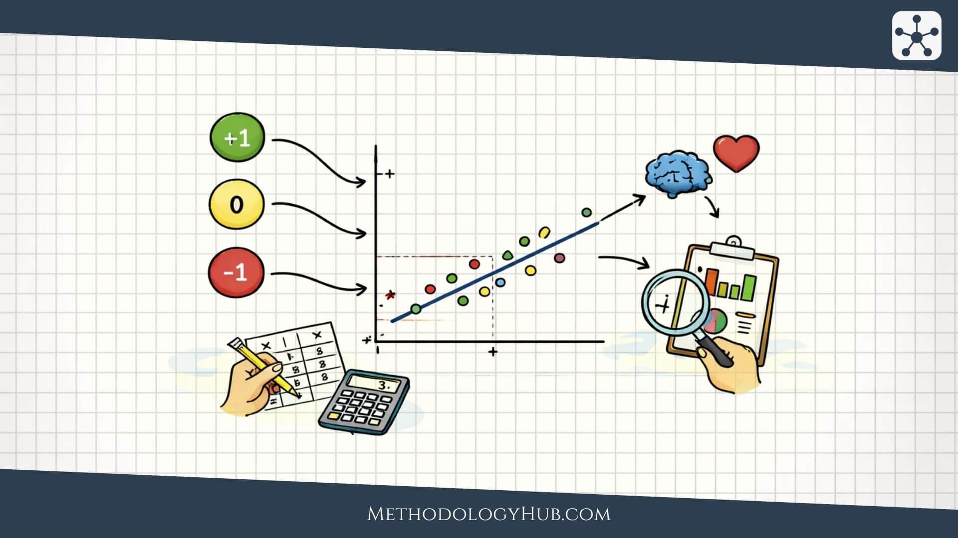
Correlation and scatter plots
A scatter plot should usually be checked before much trust is placed in a correlation coefficient. The plot shows what the number compresses. It can reveal outliers, clusters, curved patterns, gaps, unequal spread, and subgroups that a single coefficient may hide.
For Pearson correlation, the scatter plot is especially helpful because Pearson measures linear association. If the relationship is curved, the coefficient may understate the pattern or describe it in the wrong way. If one outlier sits far from the rest of the points, it may pull the coefficient toward a value that does not reflect the main cluster.
What to look for in the scatter plot
- Overall direction: do the points tend upward, downward, or neither?
- Shape: is the pattern roughly straight, curved, or split into groups?
- Outliers: are a few points driving the coefficient?
- Clusters: do different subgroups behave differently?
- Spread: does the variation widen or shrink across the range?
A scatter plot does not replace the coefficient. It tells you whether the coefficient is a fair summary of the data. A neat-looking correlation number paired with a strange scatter plot should make the analyst slow down before drawing conclusions.
Outliers and influential points
Outliers are not automatically mistakes. A very high measurement may be genuine, a participant may truly have an unusual score, and a laboratory value may be extreme because the underlying process is extreme. The issue is not the mere presence of outliers. The issue is that a small number of unusual points can dominate the correlation.
The right response is not always to remove them. First check whether the value is a data entry error, a measurement problem, or a valid observation. If there is a legitimate reason to question its influence, compare the correlation with and without the point. When the conclusion changes completely, the report should say so. Hiding that sensitivity makes the analysis look cleaner than the evidence allows.
Clusters and subgroups
Sometimes a full dataset shows a correlation because two or more groups have been combined. Inside each group, the relationship may be weak or absent. A dataset containing both children and adults, for example, may show a strong relationship between age and reading speed, while the relationship within a narrow age group is much smaller. The overall correlation is real for the combined data, but it may not answer the question the researcher cares about.
That is why subgroup structure should be checked whenever it is relevant. Schools, clinics, age groups, laboratories, regions, and experimental conditions may each behave differently. A single coefficient can flatten those differences into one number.
Correlation and causation
Correlation is often mistaken for causation because a strong relationship can feel persuasive. When two variables move together, it is natural to think that one produced the other. That may be true, but correlation by itself does not show that it is true.
Several other explanations may be possible. A third variable may explain the pattern. The assumed direction may be reversed. Selection bias may shape the data. The association may appear only because different groups were combined. The result may even be accidental, especially when many variables are tested at once.
Common reasons correlation does not prove causation
- Confounding: another variable influences both variables being studied.
- Reverse direction: the assumed outcome may actually influence the assumed cause.
- Selection bias: the data only includes a non-representative group.
- Subgroup mixing: a pattern appears only because different groups are combined.
- Random coincidence: a pattern appears by chance, especially after many comparisons.
For example, physical activity may be correlated with lower disease risk in an observational study. Activity could help reduce risk, but healthier people may also be more able to be active. Diet, income, access to care, and other factors may explain part of the association as well. A causal claim needs a design that deals with those alternatives.
What would strengthen a causal interpretation?
A causal interpretation becomes more credible when the study design rules out competing explanations. Randomized experiments are often stronger because assignment is controlled. Longitudinal data can help because the timing is clearer. Careful adjustment can reduce some confounding, although it cannot adjust for variables that were never measured. Natural experiments, matched designs, and causal inference methods may also help when randomized experiments are not possible.
Even then, the wording should remain careful. A correlation can support a causal argument when it is combined with a strong design, a plausible mechanism, clear timing, and sensitivity checks. It should not be asked to carry the argument on its own.
How to choose a correlation method
Choosing a correlation method starts with the data rather than with the name of the coefficient. Pearson, Spearman, and Kendall correlation are all useful, but they do not answer the same question in every situation.
Step 1 – identify the variable type
If both variables are numerical and measured on a meaningful scale, Pearson correlation may be suitable. If the variables are ordinal, ranked, or based on ordered categories, Spearman or Kendall correlation usually fits more naturally.
Step 2 – check the shape of the relationship
If the scatter plot shows a roughly straight-line relationship, Pearson correlation may summarize it well. If the relationship is consistently increasing or decreasing but curved, Spearman correlation may fit better because it works with ranks.
Step 3 – look for outliers
Outliers can have a large effect on Pearson correlation. If one or two observations are pulling the relationship, the coefficient may not describe the main pattern. Rank-based methods are often less sensitive, although they still require careful data checking.
Step 4 – decide what interpretation you need
When the aim is to measure linear association between raw numerical values, Pearson correlation is usually the first choice. When the aim is to measure ordered association, Spearman correlation may be better. When the aim is to explain pairwise agreement in rankings, Kendall’s tau may be clearer.
Step 5 – check whether correlation is enough
Sometimes the real decision is not which correlation coefficient to use, but whether correlation is too limited for the question. If the analysis needs to adjust for age, baseline score, clinic, classroom, treatment group, or other variables, regression may be more suitable. If the goal is to compare groups, a group comparison method may be more direct. If the goal is cause and effect, the study design matters more than the coefficient.
This final check helps prevent correlation analysis from becoming a reflex. Correlation is well suited to pairwise association. It is less suited to questions involving several variables, repeated measurements, nested data, or causal claims.
Correlation analysis examples
Examples show both the usefulness of correlation analysis and the care it requires. In each case, the method summarizes an association, while the interpretation still depends on how the data was collected and what the study can support.
Example 1 – study time and exam score
A teacher may record how many hours students practiced before an exam and compare those hours with exam scores. If students who practiced more tend to score higher, the correlation may be positive. That result does not prove that practice time alone caused the higher scores, because prior knowledge, sleep, attendance, and access to support may also affect performance.
This example suits correlation analysis because both variables can be measured as quantities. The teacher can also check a scatter plot to see whether the relationship is roughly linear. If the pattern is mostly upward but a few students with very high practice time scored poorly, the next question is whether those cases reflect measurement error, unusual circumstances, or a real limit in what practice time explains.
Example 2 – blood pressure and age
A health researcher may study whether systolic blood pressure is associated with age in a sample of adults. A positive correlation may appear if older participants tend to have higher readings. The result describes the association in that sample, but it does not explain the biological mechanism or account for medication, activity, diet, or medical history.
This example also shows how correlation can start a deeper analysis. If the researcher only wants to describe the relationship, correlation may be enough. If the researcher wants to compare age groups while accounting for medication use and other factors, a regression model would usually be more appropriate.
Example 3 – two raters scoring essays
Two instructors may rank the same set of essays from strongest to weakest. A rank-based correlation can show whether their rankings are similar, which is useful when the exact score difference matters less than the order of the essays.
If the instructors generally agree on which essays are stronger, the rank correlation will be positive. If their rankings are almost unrelated, the coefficient will be near zero. If one instructor’s high-ranked essays tend to be the other instructor’s low-ranked essays, the coefficient may be negative. The coefficient summarizes agreement in ordering, but it does not explain why disagreements occur.
Example 4 – air pollution and lung function
An environmental health study may examine whether particulate matter levels are associated with lung function measurements. A negative correlation may suggest that higher pollution levels tend to appear with lower lung function scores. The pattern may be scientifically interesting, but it still needs careful interpretation.
Air pollution may also be linked with neighborhood characteristics, occupation, smoking exposure, age, or access to healthcare. Correlation can show that the measurements move together. It cannot isolate the full causal pathway on its own.
Conclusion
Correlation analysis is useful because many research questions begin with association. Do two measurements move together? Does one score tend to rise when another rises? Are two rankings similar? Is there a relationship worth studying in more detail? A correlation coefficient gives a compact answer to those questions.
That compact answer is also where the risk lies. One number can make the data look cleaner than it is. A proper interpretation still needs the scatter plot, the type of data, the shape of the relationship, the sample size, and the possibility of outliers or confounding variables.
The safest habit is to treat correlation as a description of association rather than proof of cause. Pearson correlation works for linear relationships between numerical variables. Spearman correlation works for ordered or monotonic relationships. Kendall’s tau works when pairwise ranking agreement is the main idea. The right method depends on the variables and on the type of relationship the analysis is meant to summarize.
FAQs on Correlation Analysis
What is correlation analysis?
Correlation analysis is a statistical method for measuring the direction and strength of association between two variables.
What does a correlation coefficient show?
A correlation coefficient shows whether two variables move together, how strong that association is, and whether the direction is positive or negative.
Does correlation prove causation?
No. Correlation shows association, but it does not prove that one variable caused the other. Causal claims need stronger study design and stronger assumptions.
What is Pearson correlation used for?
Pearson correlation is used to measure linear association between two numerical variables when the pattern is roughly straight-line.
When should I use Spearman correlation?
Spearman correlation is useful for ordinal data, ranked data, or relationships that are monotonic without being strictly linear.
Why should I check a scatter plot before interpreting correlation?
A scatter plot can reveal outliers, curved patterns, clusters, and subgroup differences that a single correlation coefficient may hide.